EMI World Revamp.
Rethinking the in-store EMI experience for the modern retail floor, building across POS and Mobile apps. Offer discovery time cut by 38% and 144%+ MAU.
02, Context
Why Was the Upgrade Needed?
Multiple journeys, an uneven UI, and slow discovery flows were creating friction for merchants. The new EMI World brings everything together into one streamlined, consistent, and high-performance experience.
The old design had 4 core problems
Before
Search deprioritised, user preferred touchpoint
Banners eat up task-first approach
Category & Brand widgets ignore store context
No IMEI scan, retail-centric entry point missing vs. competitors
Naming convention & product duplicacy, no cues to identify the right result
Lack of SKU cues, products look identical with no differentiating metadata
Product name labels often truncate, critical info cut off
Amount shown is indicative, leads to drop-offs and confusion on the sales floor
Filter options hidden and deeply nested, hard to reach mid-flow
Misses nudge to update & match product prices in real time
Shortlist interaction is redundant, lacks usability for field sales staff
Becomes a product description page, sales staff need transaction closure, not specs
Pagination maintains context but clutters the UI unnecessarily
No color or image cues, slows exploration and offer selection
Grid clutters all banks together, no logical hierarchy or prioritisation
High cognitive load widget, no intent-driven experience for the user
No visual recall, nothing to anchor recognition across the flow
Plain breakdown, no highlights or hierarchy, raises cognitive load
03, Users
Who the users are
Three distinct roles. One shared surface. Designing for one at the expense of the others would mean designing for none.
Store Agent
Goals
Pain points
Surfaces
Merchant
Goals
Pain points
Surfaces
Store Manager
Goals
Pain points
Surfaces
04, Research
Stakeholder Insights
Stakeholder interviews surfaced a consistent pattern: technically capable, experientially opaque. Twelve themes shaped the design mandate.
Grounded into 3 design principles
Task First
The agent is in the middle of a sale. Discovery and information are welcome, but they can't obstruct the primary path. Everything else is secondary to closing the transaction.
Directed but Recoverable
Guide the agent toward completion. But if something goes wrong, there's a clear way back to where they land within the context.
Unified Design Language
Same colour tokens, same component family, same interaction patterns as the Payments app. A user moving between surfaces should feel continuity, not friction.
05, Research
Competitive Benchmarking
Two fintech checkout apps benchmarked across discovery, comparison, and checkout flows. Green = borrowed. Red = designed against.
Pros
Cons
Pros
Cons
06, Architecture
User Flow
Two entry points. Two intentionally different goals. One coherent system underneath.
Entry Point 01
Payments App Path
Focused, shows only offers on active pay-mode
Entry Point 02
EMI World Path
Exploratory, full offer landscape across all issuers
Payment mode branches
The app-to-app integration architecture gives agents two distinct entry points. Transaction status handling also branches accordingly, Payments App paths resolve to simple success/failure, while EMI World paths handle pending states for QR, link, and card-swipe modes, each with a defined recovery path.
06b, Prioritisation
What We Chose to Build First
Not everything could ship at once. The matrix maps features by impact and effort, the top-left quadrant became Sprint 1.
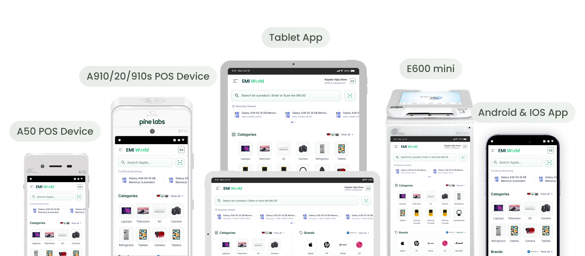
06c, Platforms
Platforms we are designing for
A clean modular app that adapts and caters to a wider ecosystem and real-time use cases. Not only brings an all-new range of platforms but stitches those journeys which were left unanswered for a major user base in and around the market.
07, Design
What's Improved Now
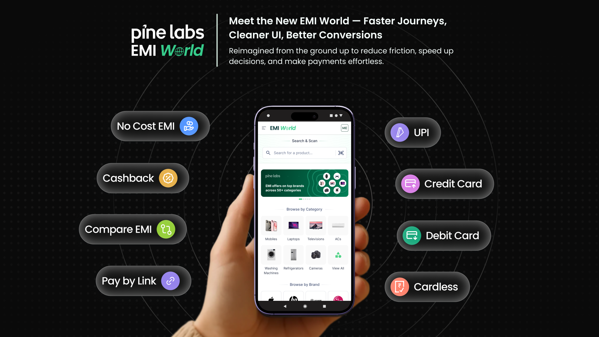
Modern Adaptive UI. Search & Scan front and centre. No Cost EMIs on 25+ Credit Cards, Debit Cards & NBFCs surfaced immediately.
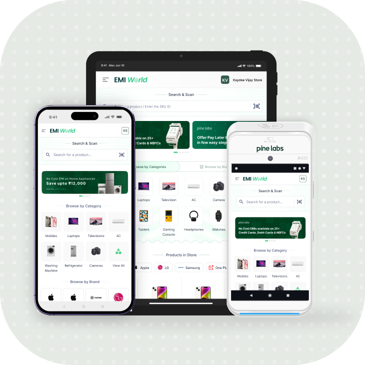
Modern Adaptive UI
A cleaner look that's easier on the eyes, fewer taps and quick to act upon.
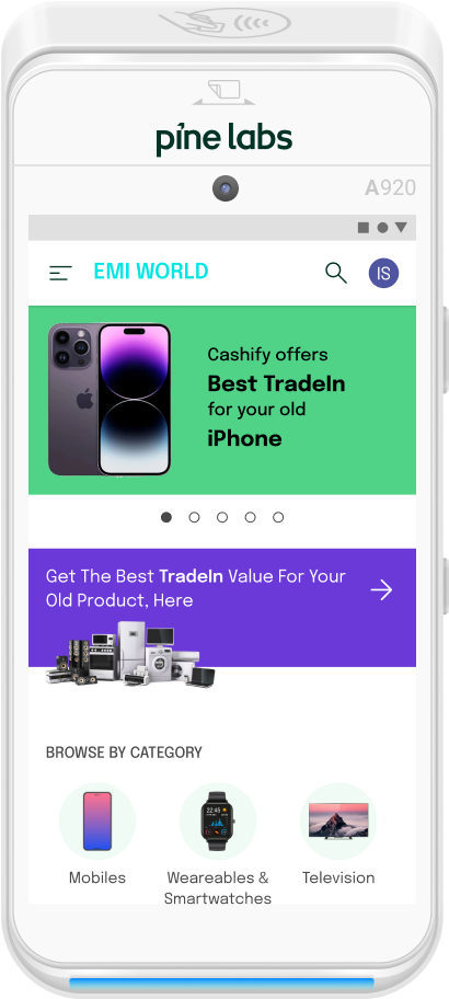
Smarter Discovery
Lightning-fast product search and offer discovery built for clarity, not clutter
Seamless Checkout
One place for all customer details and checks, designed for faster closes

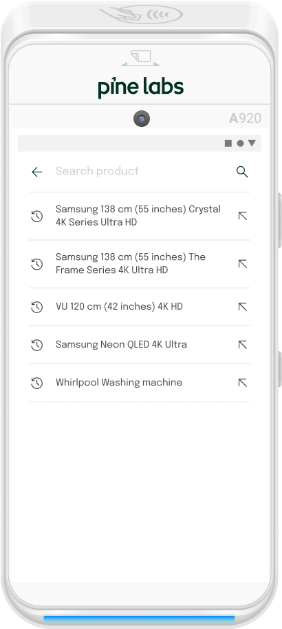
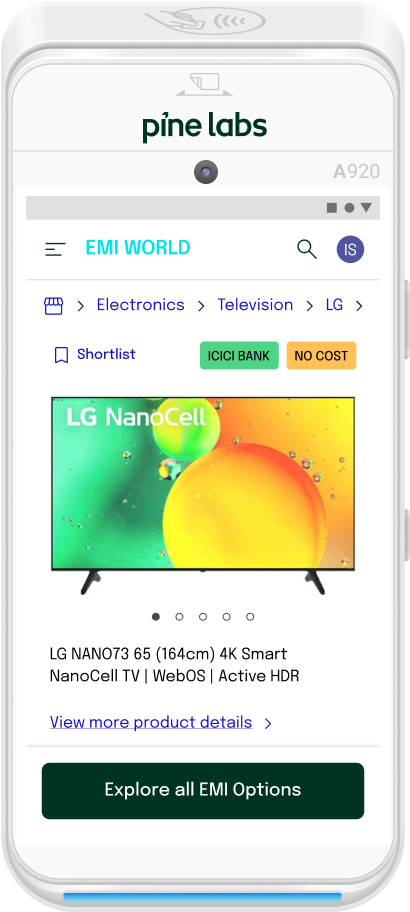
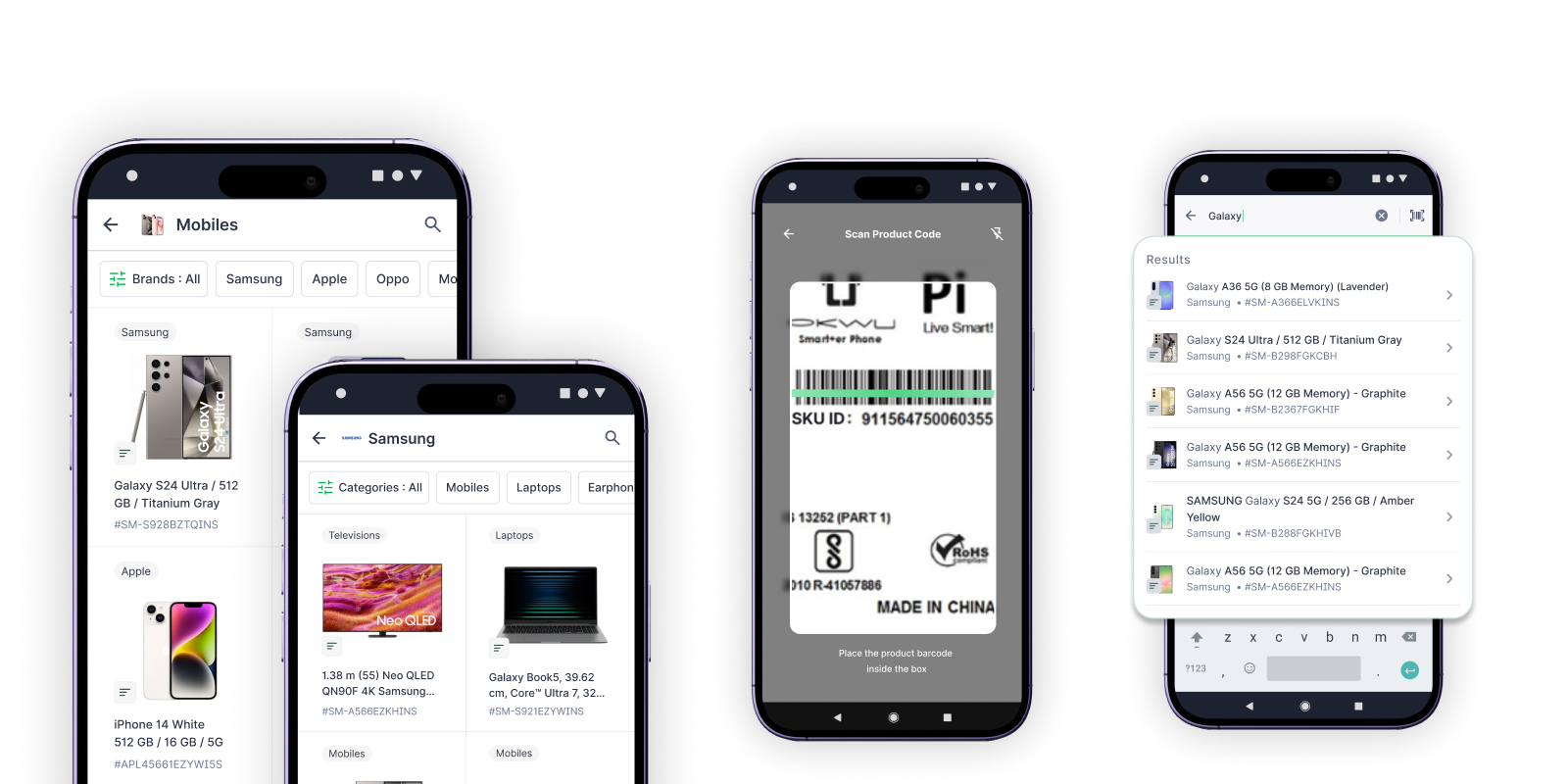
Product Search & Discovery Redefined
Improved Search
- 01
Prominent search bar and SKU barcode scanner on the home screen
- 02
Faster search results enabled by Elastic Search
- 03
Search by product name or SKU code
- 04
Typo resistant and partial match support
- 05
Quick access to recently viewed SKUs
Improved Product Landing Pages
- 01
Popular brands and categories are front-loaded
- 02
Contextual search – search within a brand or category
- 03
Clear product information with description tags
- 04
Expanded product views to accommodate long product names
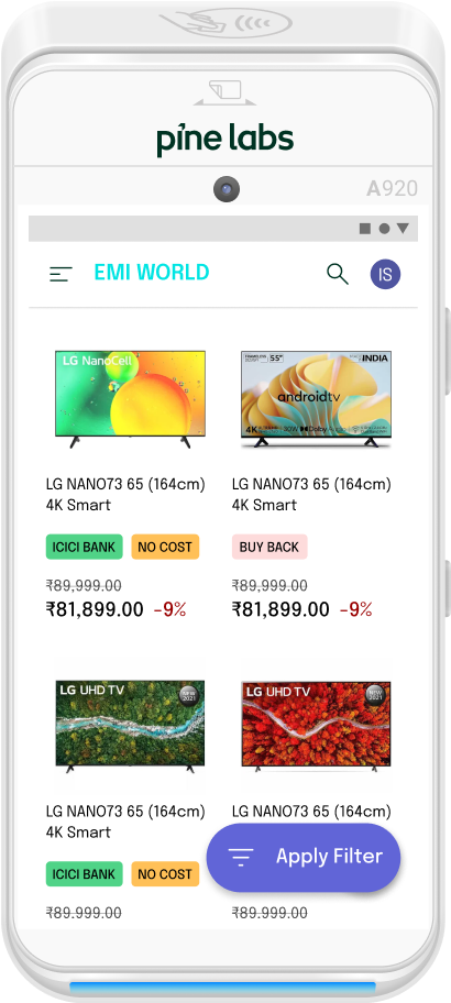
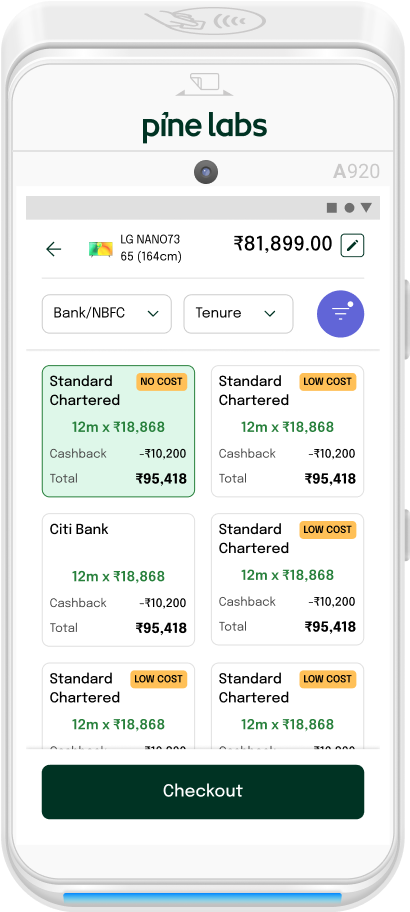
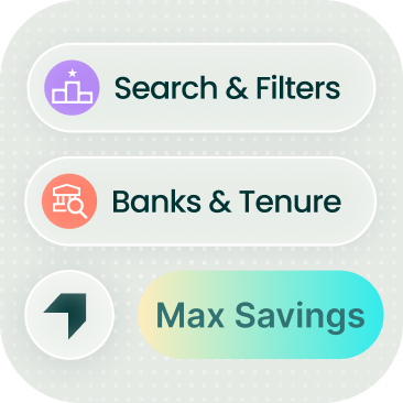
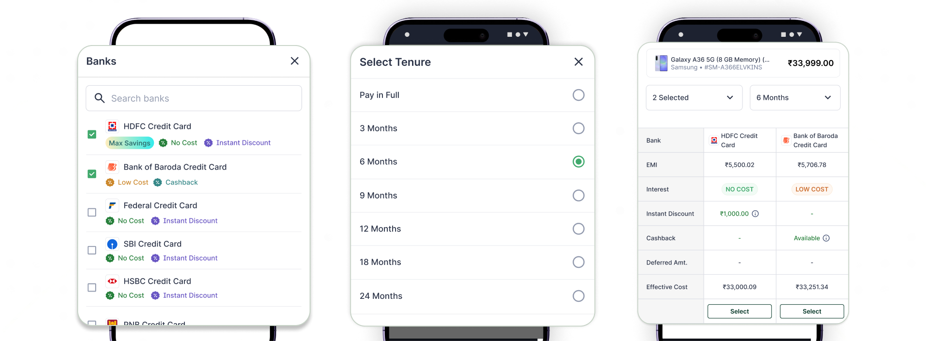
A More Intelligent Way to Browse Offers
A redesigned layout that highlights the best offers upfront, simplifies comparison across banks, and enables faster EMI decisions with minimal cognitive load.
Best Offer Highlighted with Max Savings Upfront
Top banks with highest savings surface immediately on the top for quicker decision-making.
Color-Coded Banks and Tenures for Instant Clarity
Visual cues help identify the most attractive EMI plans at a glance.
Multi-Bank Peek for Faster Comparison
Easily glance through offers across multiple banks without extra taps.
Accordion Layout for Clean Browsing
All tenures grouped neatly per bank, reducing scroll fatigue and noise.

Compare EMI Plans Across Banks
Payment mode tabs, bank filters, and offer tags let merchants surface the right EMI plan in seconds, no scrolling through noise.
Payment mode tabs
Credit Card, Debit Card, Cardless, and UPI, all in one place, zero context switching.
Bank & offer filters
Filter by No Cost, Instant Discount, or specific bank, narrows choices immediately.
Max Savings surfaced first
Best offer per bank auto-ranked upfront so merchants lead with the strongest deal.
Offer tags for instant read
No Cost, Low Cost, Cashback, and Instant Discount badges make plans scannable at a glance.
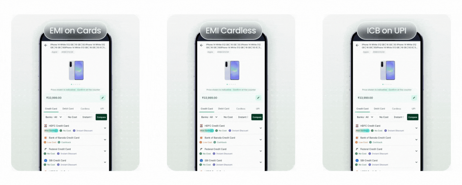
All Payment Instruments in One Place
A cleaner, more structured way to compare EMI options across banks, helping merchants pick the best plan in seconds.
Customize Purchase
A new centralized “Customize Purchase” screen brings insurance and future VAS into one place, before the summary, where it belongs. The most suitable insurance plan is auto-suggested, with a gentle caution if the user removes it.
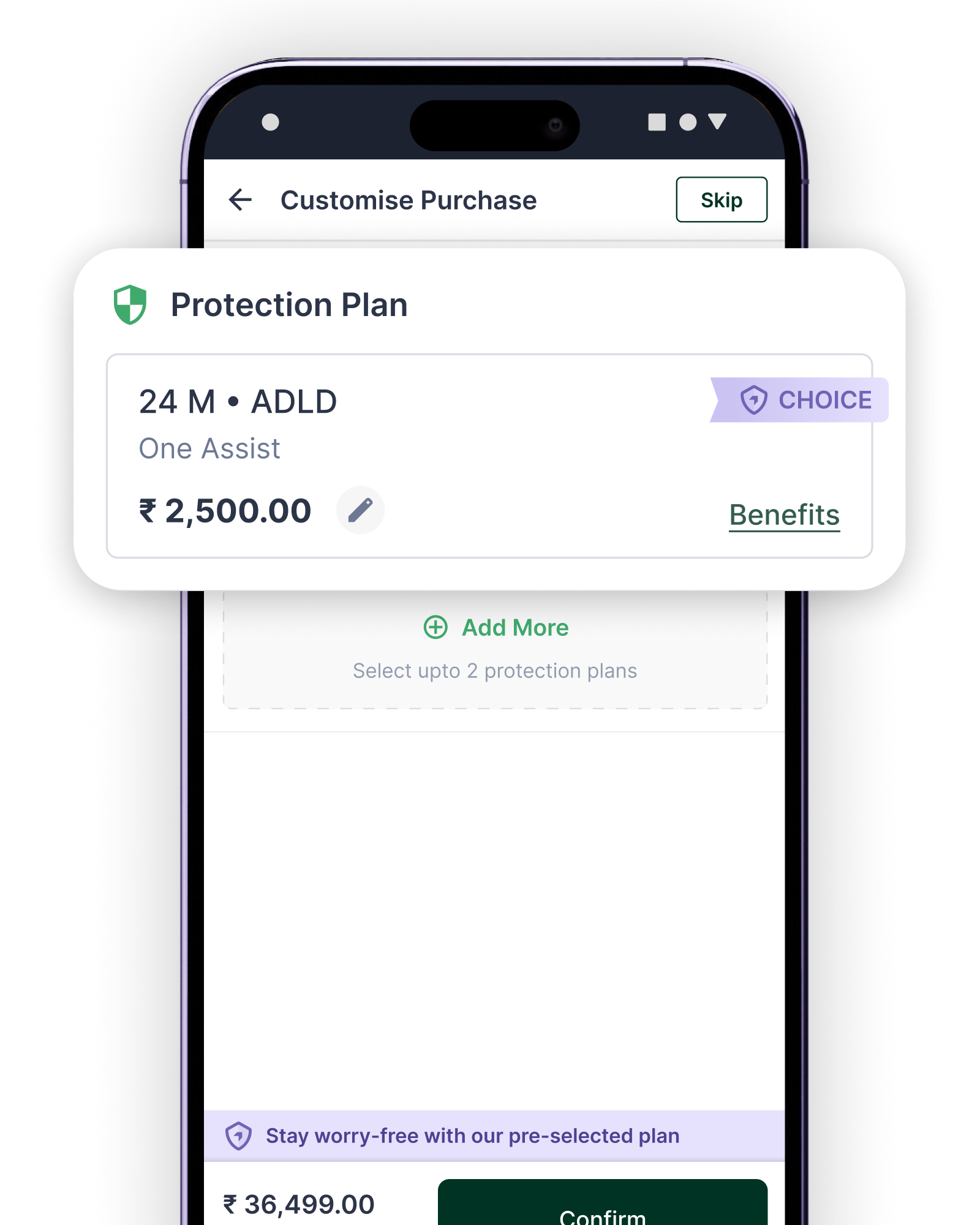
Auto Attach Plan
Best-fit protection plan pre-selected and surfaced inline, merchant can edit or skip.
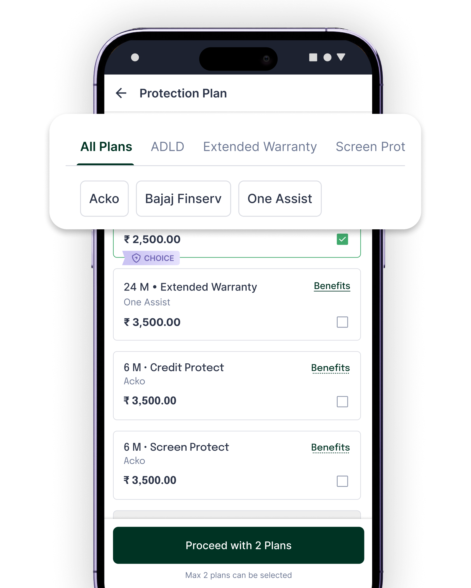
Browse Protection Plans
Filter by plan type and provider, ADLD, Extended Warranty, Screen Protect across Acko, Bajaj Finserv, One Assist.
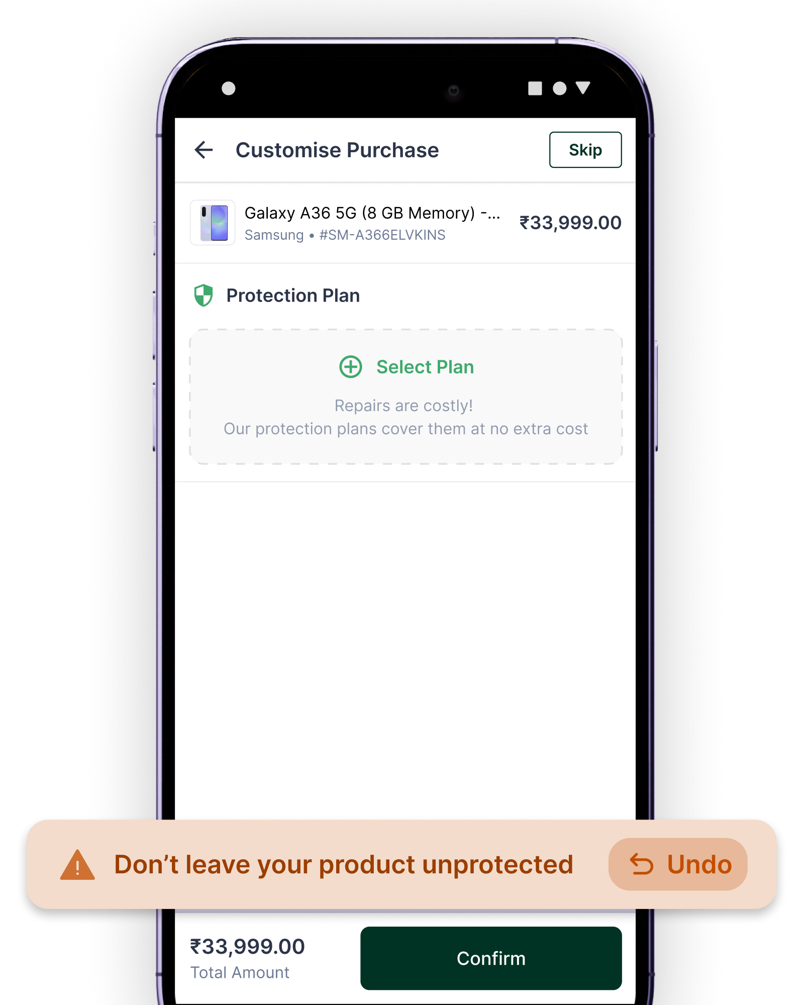
Smart Nudges
"Don't leave your product unprotected" toast fires gently if the plan is removed, reducing opt-out without being pushy.
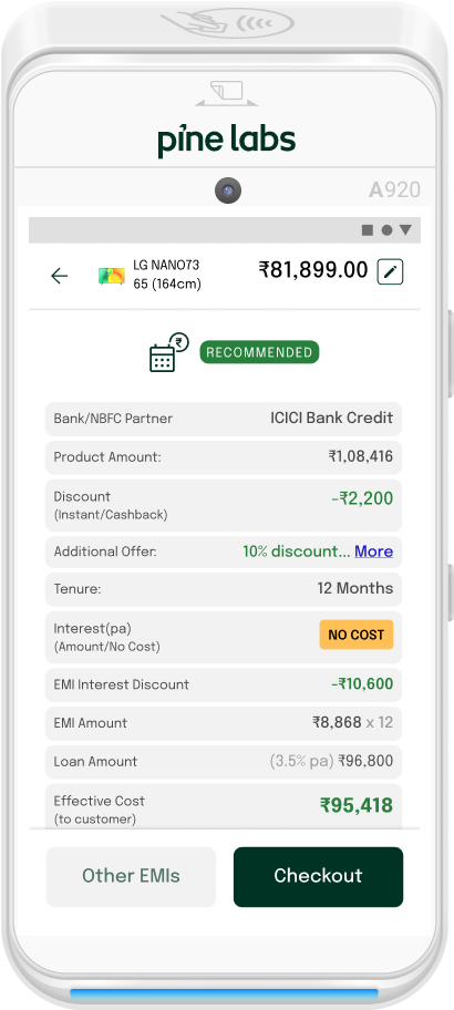
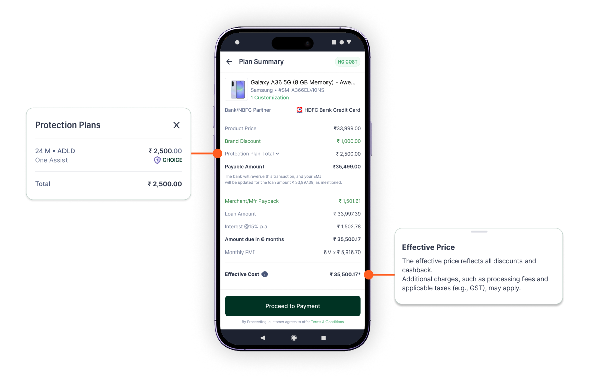
Enhanced Summary Screen
A clearer, smarter final review that improves accuracy and speeds up approvals.
- 01
Transparent EMI Breakdown
A cleaner layout showing exactly how the EMI amount is calculated, including all VAS elements if opted for.
- 02
Built-In Consent Capture
Customer agreement to terms is recorded seamlessly on the same screen.
- 03
Unified View for All Payment Instruments
A consistent summary design for card, cardless, and UPI flows.
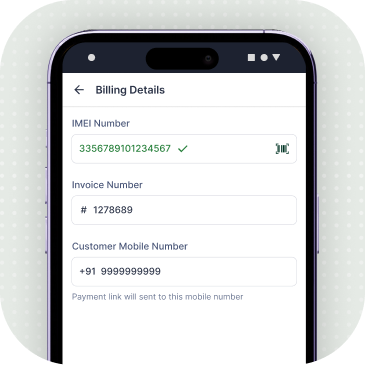
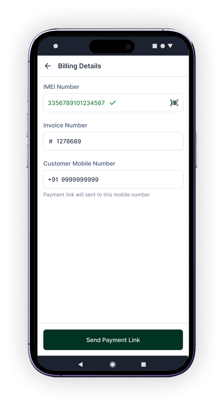
Consolidated Billing Details Screen
All input and billing information are organised into one streamlined step for a faster, error-free checkout.
One Unified Input Screen
No more hopping between pages, every detail is captured in a single view.
Real-Time IMEI / Serial No. Validation
Instant checks for supported brands to ensure quick eligibility confirmation. This will significantly improve success rates.
Dynamic Fields Based on Brand & Merchant
Only the relevant inputs appear, nothing extra, nothing missing.
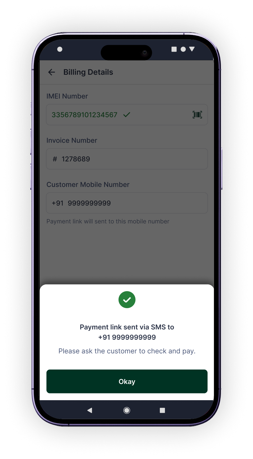
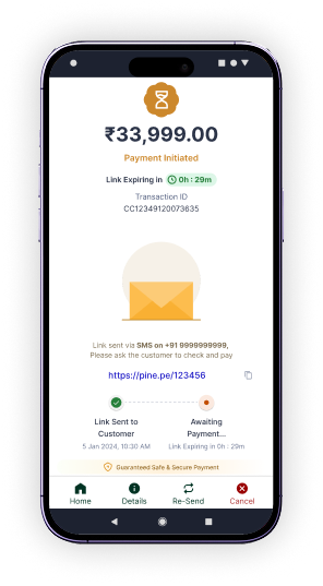
Smart Flow for Payment Links
If Pay by Link is chosen earlier, the CTA adapts to send the link directly.
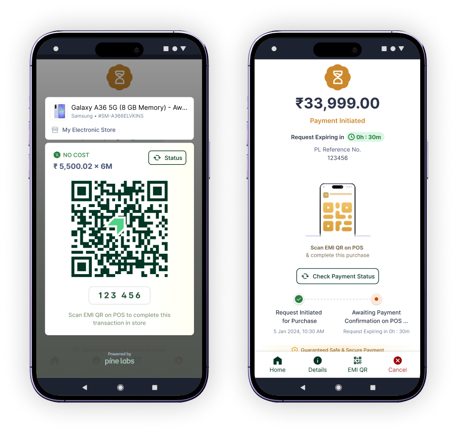
EMI World Mobile Checkout
Express Checkout via Offer QR Scan
A smoother, faster way to transact, especially during rush hours. We’re enhancing the cloud-to-POS journey so merchants can:
Find offers on mobile instantly
Merchants browse and select EMI offers directly from their mobile before heading to the POS.
Generate a scannable Offer QR
Selected plan generates a unique QR code and numeric code for quick POS scanning.
Walk to any available POS and scan
No queue dependency, scan at any free terminal to continue the transaction seamlessly.
Offer consistency & auto-validation
System handles offer integrity and validation across the store automatically on scan.
08, Outcome
What changed
Engagement
+144%
MAU since the launch Feb'26
Activation
26,569
New user activations from Mar'26 to Apr'26
Weekly Active
+24%
Weekly active users, avg 1,50,000
Retention
+8%
Champion users engaging daily on the platform
App Preference
32%→65%
User preference shift to EMI World App over Payments App
Mobile Engagement
+28%
Increase in user engagement on the mobile app
09, Feedback
User Feedback
A detailed market study to gather user feedback was carried out among 20 stores and 40+ user sample to understand the pilot and version 1 market response.
Usability
App Feedback
Painpoints
Next project
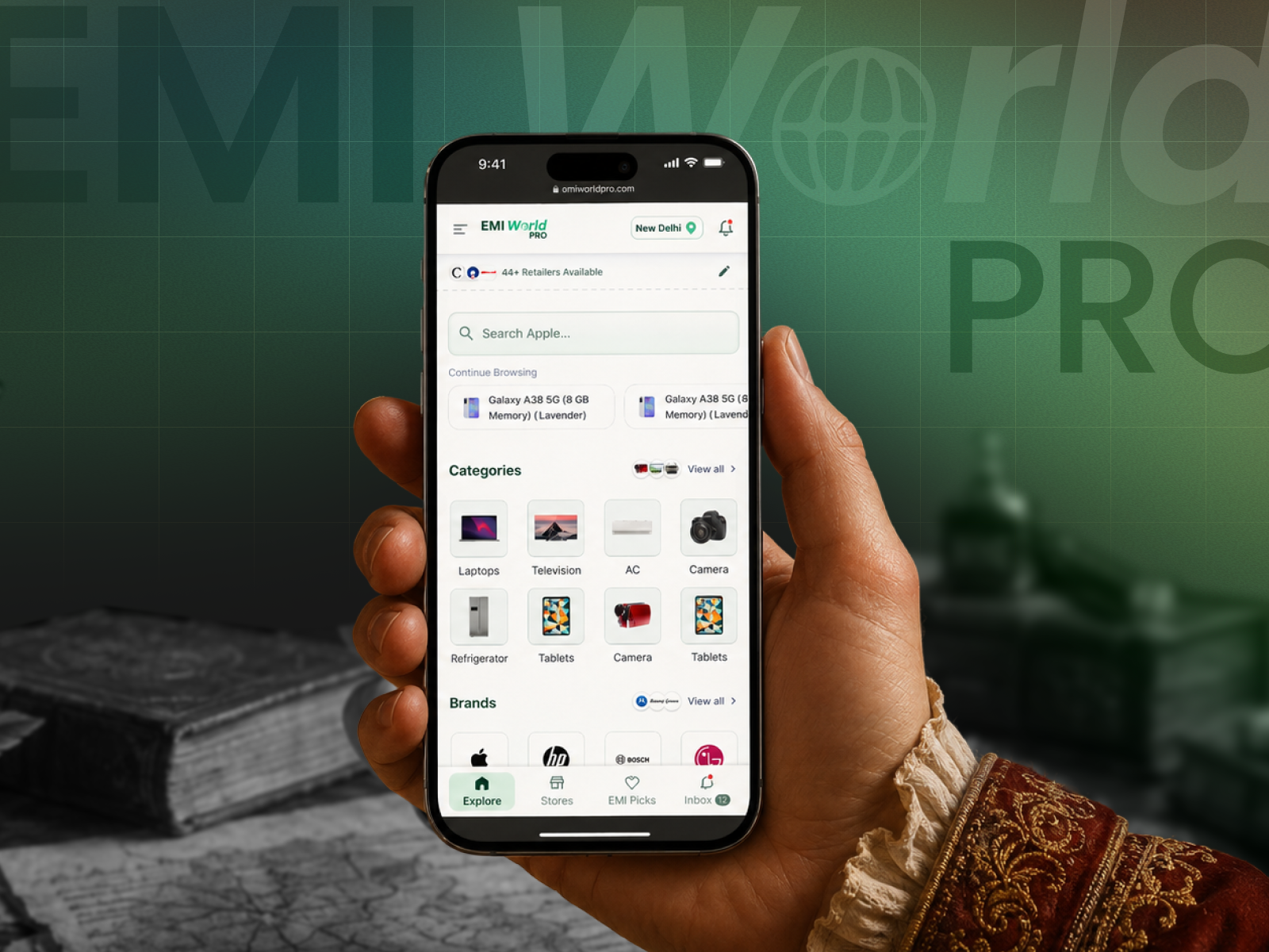
EMI World Pro.
A queue buster checkout solution for customers and outreach expansion platform for retailers and brands. Set to launch for 12 tier 1 & 2 cities across 5+ popular retailers.